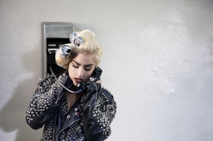
Lady Gaga and Rodney Jerkins produced the song ‘Telephone’ originally for Britney Spears. However, plans fell through and Lady Gaga chose to record the track herself. The video became a follow-up to the video for ‘Paparazzi’.

The song is aimed at a mainly young audience (teens – twenties) of both men and women. The song attracts this audience as it is pastiche – a blend of RnB, pop and dance – and so rather an up beat dance song, typical of the sort of music younger people like.

The video attracts these audiences also through its use of representation. Women are attracted to the video, as women are represented as very strong, in-control characters in the video. For example, all the women in the prison seem to be in control as they do as they please. Lady Gaga and Beyonce go to the cafe and kill everyone and then get away with it which shows them to be very powerful women.

Men are represented as being weak. The main male character represented in the video is Beyonce’s boyfriend and he goes to the restaurant and is oblivious he is being poisoned by Beyonce and Lady Gaga and he dies.

However, men are still attracted to the video partly because of the provocative way that Lady Gaga and Beyonce dress.

The video for ‘Telephone’ follows many conventions of a typical pop/dance/RnB video.

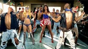
For example, The video features Lady Gaga and Beyoncé performing a dance routine.

The performers also follow conventions by miming along to their song throughout the video.

‘Telephone’ also follows conventions through its use of a bright colour sc heme. The video is never dull and the screen is always filled with colour.

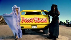
However, the video goes against conventions as Lady Gaga and Beyonce do not always wear ‘sexy’ or revealing clothes. Later on in the video, the two of them wear outfits that cover them up from head to toe.

The video also breaks conventions as the locations and image of the artist is not always glamorous and classy. Lady Gaga in seen in a prison with nothing but tape wrapped around her.

The video could be said to be postmodern because it breaks the rules of a ‘typical’ ‘normal’ music video. Its different and there’s never really been anything like it before.

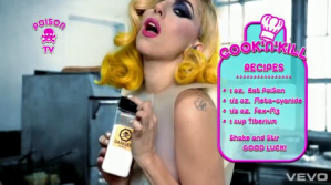
Firstly, there is lots of inter-textuality throughout the video. For example, when the screen turns into a DS game like screen, with the ingredients flashing up as Lady Gaga poisons the food.

Similarly, when poison is poured into drinks a little poison sign pops up, drawing attention to the fact you are watching a music video.

And the Pussy Wagon is what Lady Gaga and Beyonce drive, which comes from Tarintino’s film and so makes reference to him and the films themselves.

Also, when Lady gaga does a Michael Jackson dance move, making reference to him.

Secondly, because of the self-reference in the video. For example, when Lady Gaga is thrown into prison the prison guard says “I told you she didn’t have a dick”. Here Lady Gaga makes reference to rumours about herself.

Finally, because of the ambiguity in the video. For example, the video leaves the audience asking many questions, such as; “why did they kill everyone?” “where are they driving off to?” “why’s Lady Gaga in prison?” The video doesn’t tie up all its loose ends.

Levi Strauss – Opposites when they are friends and therefore happy and then when they fall out they are sad.

Barthes – Hooks audience. They question ‘will they make up?’ ‘why did they argue?’ ‘how did she die?’

Todorov – Equilibrium (they are friends), disruption (they argue), realisation (gets phone call from friend), attempt to repair (she tries to call her friend) new equilibrium (she visits the grave and makes peace)

Examples:

Barthes – Hot N Cold by Katy Perry. Will she marry him?

For the inside of the CD album we decided to use a photos of the artsit stood in a mirror again, so the synergy continued with the idea of ‘Reflections’ as the album is called ‘Reflections’. We decided for her to her this pose looking away, to create her ‘mysterious’ image, as creating an image is essential for pop stars. The artist is again wearing lots of make-up, has her hair styled and is wearing big statement earrings which all contribute to her classy image.

On photoshop, we again edited the light on the photograph, so the image looked shinier and therefore classier.

We kept the colour scheme the same, with the black and white, as the front and back cover are all in black and white, so they all fit together with the synergy between them as a package.

The left side features the lyrics to the song ‘Hurt’ which we made our music video for, as this is typical of what you would find inside the cover of a pop album. We kept the text the same as the one we used on the front and back covers and the poster advertising the album, by keeping it white and the same size and font.

On the right, is where we used the photograph, and this is where the CD would be placed over the top of the photograph. We found this was typical of other albums of the pop genre.  For example Pink’s album ‘Missundaztood’, where on the inside her photograph features where the CD would be placed.

What have you learnt from your audience feedback?

We asked people roughly our age and a little younger than ourselves (14-18 year olds) both male and female, although mainly females to watch our video and comment on what they thought about it. We asked our friends and people in our year at school, as well as my little sister and her friends so we would get a variety of opinions.

We asked these people to watch our video as younger people tend to listen to pop the most, particularly girls. The main target audience for the music video we made therefore was a mainly young audience, mainly made up of girls.

We asked them to watch the video and then asked them for any positive comments or negative comments and we wrote down what they said.

We were happy with our feedback as it was mostly very good.

A common positive point picked up on by the people we questioned, was that it had a strong storyline, with a suprising shock ending. One person to view it said “I thought it was really clever to show the grave at the end. Although I had thought her friend had died, it was still a suprising ending – really good!”

Another positive point picked up on was the way our performer mimed along to the lyrics. The performer we used in our video was a drama student and so we knew she’d be a strong, confident performer and could mime really clearly. The feedback from the people who watched the video were very impressed with her performance. People commented saying, “When she mimed, it looked so realistic as if she was actually singing.” and “Her performance was really strong. She really went for it and got into character which looked great.”

Also mentioned by those who watched the video, was how the mis-en-scene worked well. People noticed the performers clothes, make-up and hair particularly. One viewer said, “The outfits the performer wore looked typical of what a popstar would wear”.

One viewer also picked up on the camera shots and angles, “I enjoyed watching the video because of the different angles things were filmed at. I liked when the performer sang there was shots looking down at her, looking up at her, looking straight-on and some from the side of her. It made it interesting.”

One negative point mentioned, was that we could have used more flashback clips of the two friends before they argued. A viewer said, “I think if more flashbacks were used, the storyline could have been made clearer.”

Overall, we learnt from their comments that we made an overall successful music video as the target audience we made the video for generally enjoyed watching the video. We learnt that our storyline made the video strong, although perhaps we could have added more flashbacks as one viewer said, just to avoid any chance of confusion. However, everyone did follow the storyline and understand it so it wasn’t too much of a problem. We also learnt that a performer in a way can ‘make or break’ a music video, in the sense that if they aren’t very confident they’re performance wont look realistic and it would let the video down. We are lucky our friend who is a drama student agreed to help us make our music video and she was confident and looked like a popstar should. We also learnt that the audience pick up on what the artist in the video is wearing, so we are glad we decided to take as much time and care over her appearance as we did, with planning the outfits, accessorizes, make-up and how she should wear her hair.

If we were to make the music video again, we would only really consider changing the amount of flashbacks. We would perhaps build up more of a background story of the two friends to show how the two had been best friends for a long time, to make it seem like even more of a tragedy when the friend  dies. Other than that though, we are happy with our video and probably wouldn’t feel the need to change anything else.

How did you use media technologies in the construction and research, planning and evaluation stages?

I used my blog to record my ideas, thoughts and plans. I presented these through my blog in stages, step-by-step of what research I did to help me make my music video as successful as possible.

I used my blog to record what music videos, album covers and adverts for albums I looked at. I wrote about the different genres I had looked at, what their conventions were and what image the artist wanted to create. I used my blog to compare the variety of videos, etc. that I had looked at to influence me when making my own music video. I felt this helpful as I could look back over it to remind myself of certain things.

I also used my blog to explain why I had done what I had. For example, when me and Claire planned our album cover we wrote on our blogs about what we were doing, what album covers influenced us, what other photos gave us the ideas, etc. I felt using the blog to be very helpful, as it was a way for me to organise my ideas.

We used my camera when we made our album cover and album cover advert. We decided due to the genre of our album, we wanted to use a photograph of the artist for the front and back cover. We used my camera to take a number of photos. We weren’t sure on what pose we wanted the artist to use when we started so we experimented with a number of poses, with different backgrounds, with the artist wearing different outfits.

We took advantage of being able to take black and white photos on the camera. We experimented with other types of photos also, such as sepia, but decided to stick with our original idea of using a black and white photo as we felt it fitted the best, for the look we were trying to achieve.

We borrowed one of the schools video camera’s in order to film our video. Neither of us had used a video camera before so we had to learn how to, although we  both found it straight forward once we got the hang of it. We used features on the camera such as the white balance to make the shots fit in with one another, with the same amount of light  used. We used the zoom also, as we wanted some close-ups of the performers face. We used a variety of angles and shots to make our music video seem as interesting as possible. I stood in a number of places to get different angles. For example, when I filmed our performer walking, I stood very close to her at times, but at other times I stood over the other side of the road, or down the street to add variety. I used the dolly to make the shots more stable.

We used the program ‘Photoshop’ in order to produce the album cover front and back and the advert. We had both used Photoshop last year when we designed our magazine covers so we were familiar with its layout and features. We used Photoshop to edit and manipulate our photographs. We made the photos appear classier and more appropriate for the front of a pop album cover by making them appear glossyer and adding shine to them using the program.

We also used Photoshop to change things about the photo we didn’t like. For example, in the photo we actually used for our album cover, originally, there was a split in the performers fringe. We used Photoshop to basically ‘fill in the gap’ so her fringe looked tidyer.

Photoshop also allowed us to add text. We chose a simple, swirly text which was typical of  the sort of text used on a pop album. We made the text white to fit in which the background.

Photoshop also allowed us to make the CD cover the correct size. We first measured an actual CD album and then on Photoshop adjusted our album the correct size.

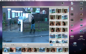
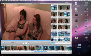
We used Imovie to create the video itself. Neither of us had used the software before and so found it a little more challenging.We explored what features the program had to offer, but found most of them to be inappropriate, as due to the genre of music video we were making, we didnt need to use any speak effects particularly. We only used one of the features to make the video fade in from a black screen at the beginning and then fade out to a black screen at the end, which is quite dramatic as she has just arrived at the grave and it is therefore revealed her friend is dead.

We used the program to organise the footage we had filmed and organise it into what we wanted to use or did not want to use. We then cut down any long clips that were too long, or just cut out part of a clip that we wanted to use. We used the program to edit the footage alongside the music, which was a bit fiddley at times because our performer did so much mimeing and we had to get it all in-sync with the track. We added certain clips at certain times of the song, for example, when the beat of the song gets faster and the drums begin to play, the argument in the video takes place, so it is like the music is creating the mood for what is happening in the video at the time. We do this again when the main performer finds out her best friend has died, she drops her mobile as violins play.

How effective is the combination of your main product and ancillary texts?

As well as looking at music videos, we also took our time to look at examples of pop genre album covers and  adverts. We found there was often a lot of synergy between them and the video. Pop album covers, their adverts and the video itself link together to create a certain image. It is impotant the main product and ancillary texts work together to create a successful promotional package.

We looked at Beyonce’s album cover for ‘I am Sacha Fierce’ and the music video for the album song ‘Single Ladies (Put a Ring on it.)’

 ‘I am Sacha Fierece’ features a photograph of the artist, as most pop album covers do. She looks very glamorous, quite natural-looking and innocent – wearing a bracelet with a crucifix on. The photo is tasteful although it does appear that she isn’t wearing any clothes. This contrasts with her innocence shown by the bracelet and shows she can also be seen as a sex object. This image therefore appeals to a younger audience of girls, as well as men. The artists name is featured in the bottom left corner and the name of the album is on its side on the left. This is quite unusual as most pop album covers feature these details at the top of the cover. We liked this way of making the album cover stand out a little more and look more interesting and so this gave us the idea of putting the artisits name and the name of the album in the bottom right corner of our album cover. Also the format of text used on Beyonce’s album cover is quite insignificant when you look at the cover as a whole. It does not draw away any attention from the photo of Beyonce, although it is clear enough.

However, what caught our eye about the photograph is how it is black and white. We thought this added an extra touch of class to the album cover. This influenced us to use a black and white photograph of our preformer for our album cover.

We chose to use this image of our artist in a mirror, as we found it to be quite an interesting pose. Beyonce’s album cover is quite unclear in that it suggests several things about the image she is trying to promote, and we felt the photo of our artist in the mirror showing her reflection was also quite mysterious in what the idea of ‘reflections’ could be trying to suggest.

We found there was synergy between Beyonce’s album cover and the music video for ‘Single Ladies (Put a Ring on it)’.

This video was shot in black and white, just like the black and white photo of her used for the album cover. Beyonce appears as very classy and glamorous as she does on the album cover. As synergy is used in this way, the audience sort of link the two together and this image of Beyonce is created.

We used this idea of synergy when we went on to design our album cover advert.

We used the idea of black and white again here. We used the image of the album cover itself, as we found many adverts did. We also used the same format of text as was used on the album cover which again links the two which promotes the artists image.

In what ways does your media product use, develop or challenge forms and conventions of real media products?

We used the song ‘Hurt’ by Christina Aguilera, which is a pop song. We studied a number of music videos of a variety of genres but mainly looked at pop videos, by artists such as, Christina Aguilera, Mariah Carey, Beyonce, Katy Perry, Miley Cyrus and Lily Allen.This was so we knew what conventions music videos in general follow and what conventions pop videos in particular follow.

We found that the singer tends to mime along to their song, and often dance routines feature, as performance in their video is crucial for their image. An example of these conventions being followed is in Miley Cyrus’s video for ‘Party in the USA’. Miley mimes the lyrics with great emphasis on certain parts of the song, particularly when her voice goes higher.

 In our video we followed this convention, as our performer frequently mimes along to the song throughout the video. We tried to replicate what Miley does in her video as our performer appears to dramatically sing and put a lot of emphasis on certain lyrics.

Another convention we found is the colour theme in pop video’s is often bright and bubbly, often reflecting the mood of the upbeat, cheery pop song. The colours used in Lily Allen’s video ‘The Fear’ are soft, girly colours which again attract the audience of young girls.

Our music video went against this convention because the mood of the song was not bright and bubbly and was in fact quite sad and gloomy. The colours therefore reflect this, for example when our preformer walks down the road, it is a cold, dull day and  it is raining. This is pathetic fallacy as the weather reflected the mood and feeling of the song.

Pop videos often feature a simplistic happy story line, usually about love where a man and woman feature, which the young girly audience who listen mainly to pop can relate with. In Mariah Carey’s video ‘We belong together’ the storyline focuses on her relationship with a man whom she loves, which is typical of the pop genre.


http://new.music.yahoo.com/videos/MariahCarey/We-Belong-Together–19014734

However, our video again goes against this convention. Of course not all pop videos feature a love storyline, and the song we chose to use for our video is one that does not. The song we used ‘Hurt’ features a storyline where it’s about loosing someone who you were close to, and telling that person you are sorry for the bad things that happened between you. We made the storyline about our performer loosing her best friend. Our video shows how they were best friends, then they had a stupid argument, and they both never rang each other to make up, and then at the end it is revealed the performer’s best friend actually died, as the preformer walks to the grave. The performer is basically singing to her friend, apologising for the stupid argument and not ringing her and therefore never making-up before she died.

We also found the mis-en-scene in the video to be important and so the pop star and any other people featured in the video tend to wear expensive designer outfits, wear lots of make up and have their hair styled which again promotes their image. In Beyonce’s video ‘Irreplaceable’, she is shown looking very ‘made-up’. Her clothes look classy and expensive, as well as her ex-boyfriends clothes. Several locations are normally used to add variety and keep the audience interested, and the house she supposedly lives in is also very flash and clearly cost a lot. By showing she has money, Beyonce promotes a ‘successful’ and ‘strong, independent woman’ image of herself, which impresses the audience as they see her as a role model they can aspire to.

Our music video followed this convention as we dressed our preformer in outfits we felt looked classy and typical of clothes you’d see in a pop video. Pop videos tend to make the artist always look nice, whatever they are doing. Our performer wore a hat, coat, jeans and knee length black boots when she walked outside in the rain, which made her look as if she still keeps up her appearence even though its a miserable day and she is walking to her friends grave. We had straightened her hair, done her make-up and added accessorizes such as the earings and a bracelet.

She wore a colourful t-shirt and a pare of shorts, and had her hair up in a neat pony-tail, whilst she was sat on the sofa laughing and joking about with her best friend. This was to make her look casual but still look nice and femine with her legs on show, showing she still looks good, even when she is sat at home with her best friend. Whist she was in the bedroom singing, we made her look very ‘made-up’, by doing her hair again, adding different accessories and dressing her in a short, patterned dress. This made her look attractive, without going over-the-top, trying to make her look really sexy. In pop videos, they tend to keep the idea of women being seen as sex symbols more low-key, in comparison to hiphop and R’n’B videos.
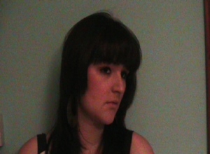
We concentrated on using a variety of locations, for example, outside  as the performer walks to the graveyard, on a sofa where the friends sit, against a wall where she mimes to the song, on the bed, etc. By using a few different locations the video is made more interesting for the audience, but we didnt use too many as this would have made it unclear for the audience, as it may become confusing. We tried to make the location in the bedroom look as glamorous as possible as thats where the majority of the filming was done. We used lights, candles and a fur throw on the bed to make the room look classy and typical of the sort of place seen in a pop music video.

Aswell as using a variety of locations, it was important to use a variety of shots and angles. Pop videos tend to use a variety of shots and angles to make the video more appealing and satisfiying to the audience, to keep them watching closely throughout. For example in Katy Perry’s video ‘Hot ‘n’ Cold’ a number of shots are used.

This picture shows a long shot of Katy Perry being filmed from down the street. We also filmed our performer from being stood down the road.

We made sure we used a variety, as we positioned the camera in different places, such as on top of the wardrobe in the bedroom. We also stood ourselves in different places such as infront of the preformer so she’d walk towards us, behind her (as shown in the picture above) from the opposite side of the road, from stood to her side, etc.

The questions that must be addressed in the evaluation are:

  1. In what ways does your media product use, develop or challenge forms and conventions of real media products? (1000 words or equivalent)
  2. How effective is the combination of your main product and ancillary texts? (300 words)
  3. What have you learned from your audience feedback? (300 words)
  4. How did you use new media technologies in the construction and research, planning and evaluation stages? (1000 words or equivalent)

How big an audience is out there?

*Huge, he would be expecting a number one album and song.

Who are they? Age? Gender?

Teens to 40 plus, he has been around a long time. Both genders would support him as he appeals to both.

Who else would they listen to?

Rhianna, Kanye West etc. and other r’n’b artisits

What do the audience get from the video?

Entertainment and they become strongly influenced by it.